Data Visualization Tools that Can Guide Energy and EV Development

The versatile online State Energy Analysis Tool produces visuals and data analyses on energy and climate at the state level as well as the national level in the United States. This information allows states to explore their potential for renewable energy and carbon markets. It provides powerful data visualization for users to access information on clean energy, carbon emissions, and industry regulations.
Georgetown Climate Center, the developer of this tool, regularly updates the state energy datasets to allow the public and stakeholders to analyze and compare current state energy portfolios. These maps and charts allow users to visualize and identify specific sectors and regions that could further reduce carbon emissions.
State Energy Analysis Tool
The State Energy Analysis Tool combines data ranging from electricity generation, environmental pollution, ZEV sales, and renewables potential to state regulations.
“This tool has a ‘state lens’ for all datasets with a focus on energy and climate. And we want to make it user-friendly for the public and decision-makers in the state,” said Drew Veysey, institute associate at Georgetown Climate Center. He led the recent upgrade of the tool.
Veysey said the State Profiles feature provides a quick snapshot of a state’s energy portfolio. This includes tables and charts on fuel use, carbon pollution, and electricity sources.
For example, a pie chart option illustrates that the major fuel used in Connecticut is petroleum. Together, natural gas and nuclear power account for 93.8 percent of electricity production. Almost half of the carbon pollution comes from transportation in Connecticut.
Another aspect of this tool is the Compare States feature.
“The comparison tool can be used to benchmark one state against another,” Veysey said. “We can then evaluate the potential of each state by comparing adjacent states with similar populations and energy sources.”
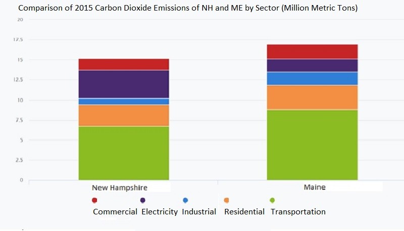
This feature is shown in the bar chart below. It compares the carbon pollution from energy by sector in New Hampshire and Maine. The colors of the bar chart represent various sectors. The y-axis shows the annual metric tons of carbon dioxide emissions from all fuel types by that specific sector.
These two states have similar population size and total annual emissions. However, Maine has higher emissions in the transportation, commercial, electricity and residential sectors than New Hampshire does. Transportation alone accounts for 8.8 million metric tons of carbon dioxide emissions in Maine. This is one of the potential sectors for emission reductions in the future.
Also, we can explore the economic benefits of capping carbon pollution through this tool. The benefits could be achieved through a market-based approach like Regional Greenhouse Gas Initiative (RGGI). Some of the economic benefits include annual revenue raised from the allowance auction, spending multiplier, and job multiplier.
For example, the Economic Benefits feature says Pennsylvania could enjoy an annual revenue of $276 million from allowance auctions. This also means there is a spending multiplier of 4.81 and a job multiplier of 73 for Pennsylvania. This assumes the allowance price is $3.6 per ton and 90 percent of the allowance is auctioned. Both assumptions are adjustable in the tool.
EV Corridor Analysis Tool
Viewers who want to take a deeper dive into transportation can explore the Electric Vehicle (EV) Corridor Analysis Tool, which hosts an interactive map of direct current fast charging (DCFC) infrastructure along corridors in the northeastern and mid-Atlantic states. Georgetown Climate Center developed this tool with M.J. Bradley & Associates.
Additionally, an Excel-based Infrastructure Location Identification Tool is available for users to identify potential DCFC charging locations. Some elements included in this tool are the current EV infrastructure location, exit location, traffic volume, commercial activity, and area demographics.
“This tool is a useful and coherent application that can provide value to EV charging infrastructure developers, state planners, and utilities,” said Matt Macunas, legislative liaison and senior marketing manager at Connecticut Green Bank. “This tool can help supplement planning data in decision-making processes. It can hopefully be a reference that supports equitable deployment of charging infrastructure in the future.”
For example, the map at the beginning of this article was produced using the tool with a focus on Connecticut. The circles in different colors symbolize various charging stations, including public and Tesla DCFC stations. The gradient color on the corridors displays the annual average daily traffic (AADT). Red represents a high traffic volume and yellow represents a low traffic volume.
The map shows that there is more DCFC infrastructure along corridors with more traffic. This is also true for the relationship between the number of chargers and population density, which is shown in the purple background. The color is darker when the population is larger.
If users want to add other layers, All Exits along Selected Corridors and Commercial Activity are also available. These two layers are helpful for users who value proximity to commercial areas and exits.
The Excel-based Infrastructure Location Identification Tool powers some of the analyses from the map. Users can download the Excel spreadsheet for free after registration and identify possible locations for DCFC infrastructure based on their priorities.
For example, users can choose their region of interest and perform an analysis using six different built-in weighting methods:
- Through Traffic is the default method, which places equal weight on all factors except for population density.
- Fill Gaps emphasizes on exits which few existing DCFC infrastructure.
- High Traffic Gaps focuses on infrastructure gap and traffic volume.
- Traveler Use weights the use of highway exits highly.
- Resident Use focuses more on local population density and commercial activity.
- Even weights proximity metrics, traffic volume, local population, and commercial activity equally.
Moreover, users have the option to customize their own weighting method in this tool based on their preference. The output of this tool is a ranking of all exits in the selected group. There is a Final Total Score for each exit.
This is a powerful and straightforward tool to visualize existing DCFC infrastructure in the northeast and mid-Atlantic states. It can be used to pinpoint promising new infrastructure locations along the corridors using various metrics and ranking scores.
To comment on this article, please post in our LinkedIn group, contact us on Twitter, or use our contact form.